By Kabs Kanu
Here is what a real newspaper should look like: It should have a good layout, newsy front , back and middle pages with feature articles as well, even if people call the content much propaganda, and balance in news placement.
A newspaper was meant to provide information in the days when there was no Internet or social media. A newspaper should contain mainly news and features, not big banner headlines covering the whole page (with no corresponding bigness in the quantity and quality of news inside ) , large front page pictures eating up much space and nothing else on that front page.
A newspaper should be a newspaper, with news starting generously from Page One.
A newspaper was meant to be produced with allowance made for ease of access to the news items to make it easier and more pleasurable to read . You could be riding a car, plane or train and sipping your coffee or waiting for a bus , with the paper infront of you, easily read from front to back page. You are not supposed to be shuttling inside different pages to find stories advertised on the front page . Items should not be scattered all over the pages , with one story in some cases , continuing in three different pages. A newspaper should be well organized and compact.
The front page should contain sufficient news items and some journalism schools advise that you must have the main stories and the editorial there , often in the same spaces or columns everyday so that readers know where to go for what they want immediately they pick up the paper. You want to believe that our journalism schools today teach the same thing about newspaper layout.
Somebody, a Mr. Jasper Patrick Semble , has complained on his wall that the typical Sierra Leone newspaper today is 80%adverts, 10% propaganda and b.s , 5% articles copied from online , 3% large headline font and 2% real news.
I noticed it myself because I receive Sierra Leone newspapers every month.
I cannot understand why our editors” fala makata ” each other by filling the front page with just one or two trashy, sensational banner headlines in color and big photos , leaving the reader having to painstakingly search inside for the items. Use the front page for news too. That is what a newspaper should look like. All your colors do not often even match and they mean nothing if the paper does not have much news. People buy papers to read news and views or features not to be impressed by color or large sensational fonts.
Adverts sell newspapers and are much needed , but we cannot afford to be cheating our readers with deceptive front pages that promise much and offer nothing , when inside the pages most of what you have are adverts and plagiarized sports news from the Internet.
A newspaper is supposed to be a newspaper –a medium with 90 or so percent news and features. If you have too many adverts, cut out the antics on the front and sport pages and provide news items , feature and op/ed articles there to make up. Have a lot of balance. The Nationalist, Torchlight, We Yone, Daily Mail, Awareness Times , Standard Times, Awoko, THE Trumpet excel in this region and deserve kudos. Even though I do not like their views , Politico also does well in this area.
By the way, I keep asking this question : Why the dearth of sports journalists ? All one sees are plagiarized foreign sports news. Don’t we have sports reporters and writers anymore ? Because today everybody starts as Editor -in -Chief and nobody takes time to start from the bottom as a cub reporter who learns the trade diligently by moving up the ladder, we have journalists who cannot write sports . Send them out to cover a soccer or cricket match and they come back with disasters called reports. They do not even understand the technical language of sportswriting.
A good and well-trained journalist should be able to cover the street beat, the courts, parliament , city council, sports, fashion, gossip column etc.etc. Our reportage of the courts is terrible. Our papers , with the exception of Awareness Times , The Trumpet, Standard Times and perhaps Awoko , hardly cover legal arguments or present accurately the legal basis on which legal verdicts were reached.
Some of our papers are very good in presenting political news and analyses like The Nationalist , Awareness Times, The Trumpet, Standard Times , Torchlight etc.Depending on your party of support, you might not agree with much of the viewpoints, but there is some depth in the analyses. I might be missing some because I have read only very few editions of the Blade and The Guardian and some new entrants. Forgive me , if I missed out your paper. Maybe, the reason I do not enjoy much of the contents of our newspapers is that by the time I read them online or receive print editions, I had already read the items or published them in my online newspapers or forums at Facebook. They are stale to me.
Note also that the
theme of this article is not a quality – analysis of our papers, per se. This is just a CONTENT ANALYSIS , centred mainly on the concentration of emphasis on big front page headlines and photos and adverts and plagiarized sports news from the Internet instead of what a real newspaper should actually carry–local and international news, features and entertainment. Not so much the quality of the content.
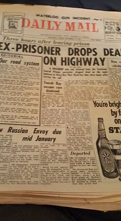
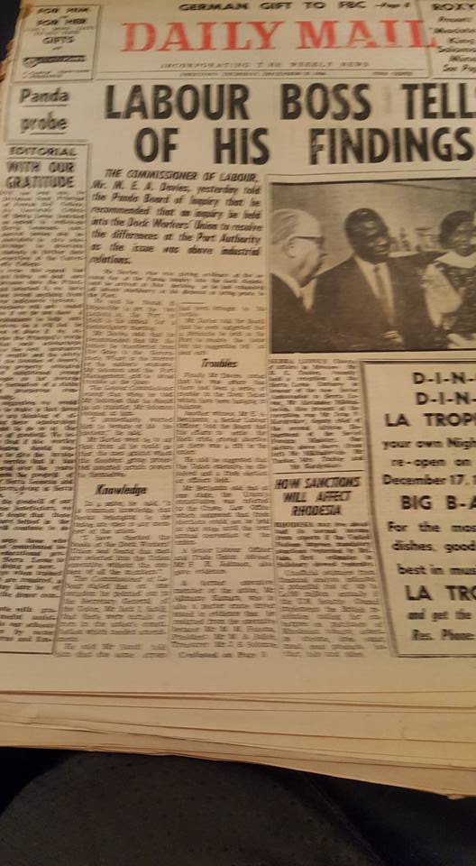
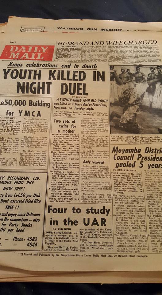
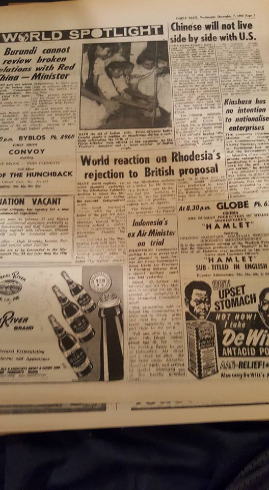
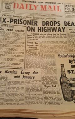
I am presenting an illustration of what a real newspaper should look like by using the iconic Sierra Leone Daily Mail of yonder years, which presents an eagle’s eye view of what a real newspaper should like .
Watch the skilful use of the front and the back pages. They are packed with news and they encourage the readers to buy the paper. There is a special page for world news and sports. Though there are adverts, the inside pages have catchy news items and feature articles that arrest the attention of the readers.
In order that nobody would argue that the Daily Mail was government -sponsored and so could not be compared to private newspapers, which need more adverts , I will also illustrate by using a 1950s Nigerian private newspaper, the Daily Service. It could be realized that the front page layout is excellent and there are many interesting news items and articles, though from a partisan perspective.
Our editors should go back to the old art of laying out newspapers and emphasizing more news and features instead of the advert- saturated, bone dry broadsheets that pass for newspapers.
I will do a quality analysis another time.

